Každý registračný formulár môže obsahovať ľubovoľný počet záložiek (krokov), pričom každý krok môže zachytávať/zobrazovať iné údaje.
Typický registračný formulár bude obsahovať aspoň dve záložky, prvú na zachytenie údajov o účastníkovi a potom druhú ako kontrolnú stránku na potvrdenie správnosti údajov a prijatie akýchkoľvek platných podmienok.

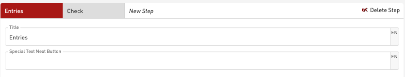
Záložka by mala mať názov, ktorý sa zobrazuje v hornom navigačnom paneli počas procesu registrácie. Jednotlivé záložky môžu mať aj aktívny dátum od/do, ak by určité možnosti mali platiť len pre konkrétny časový rámec. Text pre tlačidlo "Ďalej" je možné voliteľne prispôsobiť.
Pri navigácii dopredu/dozadu medzi krokmi obsah, ktorý sa má zobraziť, vypočítava server, takže formuláre môžu dynamicky vypočítať údaje. Je tiež možné vynútiť krok na obnovenie zobrazených údajov pomocou možnosti Rozšírené nastavenia.
Prvky
Prvky v každom kroku sú polia formulára / zobrazovacie polia, ktoré sa zobrazujú používateľovi.
Prvky môžu byť odsadené vpravo/vľavo na označenie potomkov konkrétnych prvkov alebo na vytváranie špeciálnych funkcií.
V skupinových registráciách možno prvky definovať aj ako spoločné, ak je pravda, prvok sa zobrazí iba raz, ale hodnota sa uloží pre všetky registrácie v skupine (pre vstupné polia). Voliteľné polia môžu byť zobrazené iba v každom n-tom riadku, čo je užitočné pri zachytávaní odlišných skupín v rámci skupinovej registrácie.
Prvky je možné vybrať pomocou začiarkavacích políčok na ľavej strane, kedy je možné vybrané prvky skopírovať, vystrihnúť alebo odstrániť. Skopírované alebo vystrihnuté prvky je možné vložiť, vždy sa vložia nad aktuálne vybraný riadok.
To umožňuje presúvať prvky v dávkach v rámci toho istého kroku, presúvať do iného kroku alebo presúvať do iného registračného formulára.
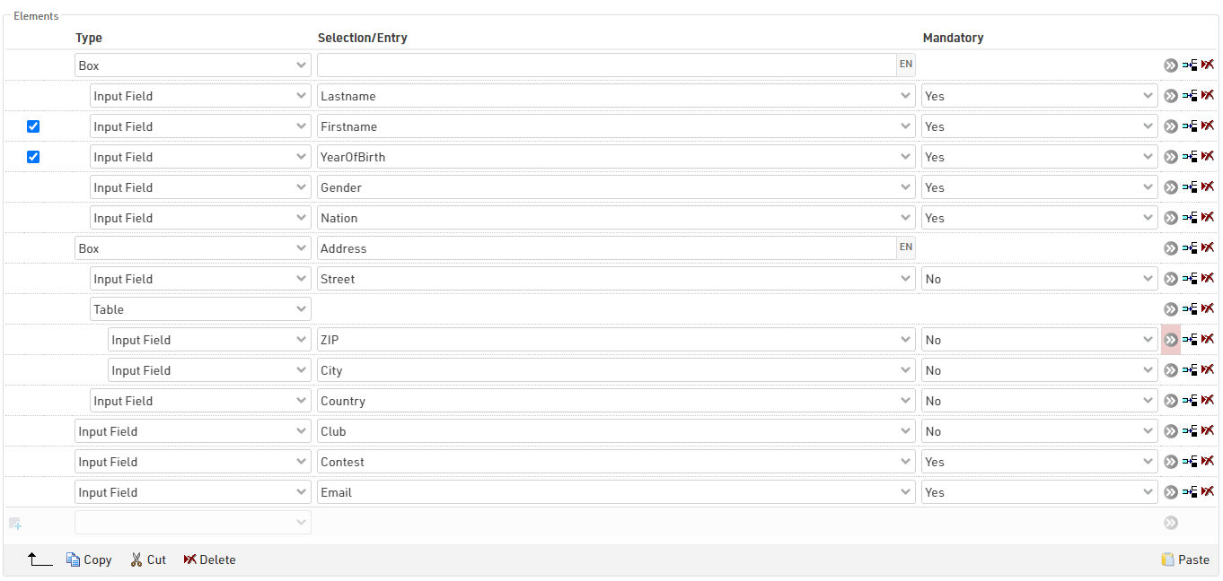
Typy prvkov
Vstupné pole
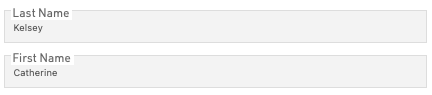
Vstupné polia sa používajú na zaznamenávanie údajov v registračnom formulári, možno ich zachytiť pre ktorékoľvek z predvolených údajových polí účastníkov alebo Ďalšie polia.
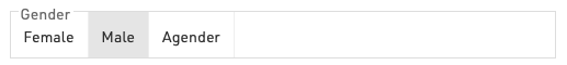
Väčšina polí akceptuje štandardný textový vstup. Niektoré polia vygenerujú špeciálne vstupné polia, ako sú rozbaľovacie ponuky pre súťaž, pohlavie alebo krajinu/národ a špeciálne zadanie dátumu pre dátum narodenia.
Ďalšie polia sa zobrazia podľa typu poľa.
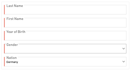
Vstupné polia možno definovať ako povinné, a keď je potrebné vyplniť hodnotu true, aby ste mohli prejsť na ďalší krok, povinné polia budú označené červeným pruhom na ľavom okraji vstupu.
Neupraviteľné vstupné pole
Na použitie v samoobslužných formulároch na zobrazenie už existujúcich údajov, ktoré by sa nemali dať upravovať.
Text
Zadajte štandardný pevný text, prázdny textový prvok možno použiť na vytvorenie deliacej čiary medzi prvkami.
HTML
Vytvorte vo formulári vlastné prvky HTML, ktoré sú užitočné na vytváranie vlastných hlavičiek alebo dodatočných odkazov na externé informácie.
Obrázok
Pridajte obrázky do formulára z obrázkov uložených v súbore udalosti, musíte zadať presný názov súboru vrátane formátu súboru. Pomocou nástroja na výber vyberte alebo nahrajte ďalšie obrázky.
Table
Na vytvorenie kompaktnejších pohľadov je možné použiť prvky tabuľky na pridanie viacerých polí do jedného riadka. Priame potomkovia prvku tabuľky sa budú považovať za súčasť tabuľky.
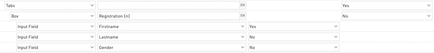
Box
Škatuľky sú užitočné na zoskupovanie konkrétnych sád polí, čím sa vytvára kartový prvok, ktorý obopína deti škatule.
Pole, ktoré sa zobrazí v hornej časti prvku, možno označiť štítkom.
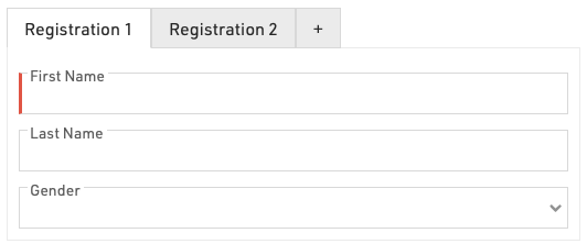
Karty
Karty možno použiť na vytvorenie prvkov s kartami v rámci jedného kroku, aby bol formulár kompaktnejší. Toto je najužitočnejšie pre skupinové registrácie na vytvorenie karty na vyplnenie údajov každého jednotlivca. Každá karta má podriadený prvok, ktorý sa zobrazuje na zobrazenie viacerých vstupných polí na jednej karte, zabaľte ich do poľa.
V skupinových registráciách Do prvého prvku Tabs formulára sa automaticky pridá ďalšie tlačidlo +, ktoré je bežné a nahrádza tlačidlo na pridanie ďalších registrácií.
Aby sa to dosiahlo pri skupinovej registrácii, prvok Tab je bežný v skupinovej registrácii a rámček obmedzujúci vstupné polia nie je bežný.
Je tiež možné použiť Zobraziť hodnotu poľa / výrazu na označenie kariet menami jednotlivých účastníkov skupinovej registrácie, napríklad na kontrolnej stránke.

Aby ste to dosiahli, prvým potomkom kariet by mala byť hodnota Zobraziť pole / Hodnota výrazu a potom by mal byť jej potomkom ďalší obsah karty.
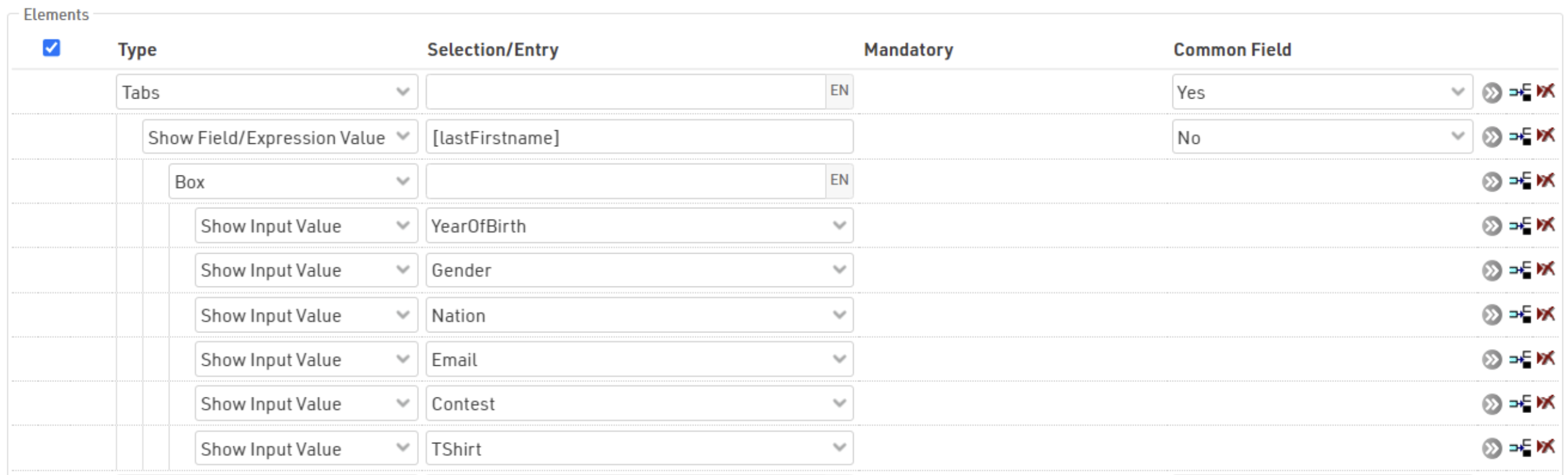
Show Input Value

Zobrazuje označenie a hodnotu zachyteného vstupného poľa, ktoré sa bežne používa na kontrolnej stránke na zobrazenie jednotlivých podrobností.
Zobraziť pole / výraz
Podobné ako Zobraziť vstupnú hodnotu, ale umožňuje vyhodnotenie/zobrazenie ľubovoľného poľa alebo výrazu. Mohlo by to zahŕňať odvodené polia, ako sú napríklad prvé priezvisko alebo vek. Zobrazuje sa iba hodnota, pretože neexistuje žiadny pevný štítok.
Zobraziť vstupné
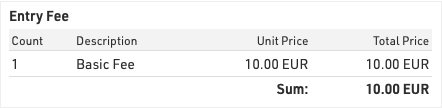
Vytvorí tabuľku, ktorá zobrazuje vypočítané vstupné poplatky až do momentu, kedy je stránka vygenerovaná.
Extended Settings
Extended settings provide additional options for each element to further customise the form. Some extended settings are shown for all elements whilst others are specific to certain types.
Active (From / To)
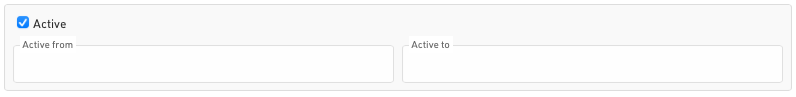
Individual elements can have a specific Active date range, or can be manually activated / deactivated, useful to keep an element in the form if it is to be copied for future events.
This setting will additionally impact all child elements.
Show If

Elements can be shown / hidden dynamically by creating a Filter, any field / function can be used in here. If the value depends on an element in the same step then the form will automatically refresh the step when that element is updated.
This setting will additionally impact all child elements.
The above example will only show the element if the field FirstName is not blank.
For Group Registration forms, an additional option for Show If determines for which participant(s) the expression must be true.
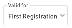
- First Registration - must be true for the first participant (other values are not considered)
- All Registrations - must be true for all participants in the group
- Any Registration - must be true for at least one participant in the group
In Self Service forms an additional option, Show If (old values), is available which only considers the original value at the time of opening the registration form.
 In the above example, the element will only be shown if the CheckBox TShirt is true before opening the form - if the value is changed, it will not be hidden.
Validation Rule / Error Message

Validation rules are evaluated when progressing to the next step of a form, and only if all validation rules return true will the user be able to progress.
The validation rule should be a Filter, and the error message will be shown in red below the element if the validation rule is not true.
The above example would show the validation error message if the FirstName field is 20 characters or greater in length.
Layout / Styling
Indented Children

Elements can be indented right / left to create child elements, this is primarily used in Box / Table Elements.
Multiple levels of indentation can be created, indented elements are considered children of the last element at the previous level of indentation.
In Table elements all first-level children will be shown on the same row, creating second-level children will then show those elements below the parent, creating columns of fields.
In Box elements all children will be shown inside the box.
Styling Attributes

The attributes are applied as HTML attribute tags to the element and so should follow the standard format for the corresponding HTML tag.
Some default / suggested values are given as a dropdown for certain tags, but custom values can also be entered
- font-weight
- font-style
- text-decoration
- color
- background-color
- width
- padding
CSS Class Name (Advanced)

Define a custom class name for the element which can be used to apply your own CSS either through the Advanced Settings or your own website CSS.
Input Fields - Extended Settings
Deviating Field Label

If an alternative label should be shown for the field, this can also be multi-lingual.
Default Value

The default value when the field is first loaded.
Placeholder

A placeholder text to be displayed in the field before any value is entered.

Uniqueness

Whether the value must be unique.
- Unique per Group Registration: The value entered must be unique within all registrations in the same group.
- Unique per contest: The value entered must not already exist in any participant registered in the same contest.
- Globally unique: The value entered must not already exist in any other participant record.
Refresh Form After Change

This forces the form to reload the displayed step when an input is modified, this can be used to update entry fees which would otherwise only reflect values calculated up to that step. This may also be useful for complex Show Only If evaluations.
Selection Values
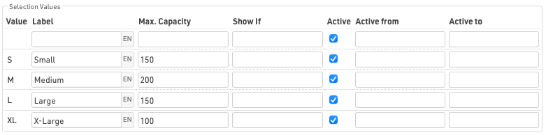
For any input field which provides multiple selection values (excluding Country / Nation selection), an additional table will be shown for the available options, certian values can be modified for each available option, including any blank / empty options
- Label - The text to be displayed if you wish to override default labels, this does NOT modify the value stored, this can also be multi-lingual.
- Max Capacity - The maximum number of accepted registrations for a specific value. Note that this limit will be imposed when progressing to the following steps and is only based on existing registrations, it is possible for multiple participants to enter the same value simultaneously which may result in the limit being exceeded. When the capacity is full - the value will be disabled and cannot be selected, but is still listed.
- Show If - Only show a specific value based on a custom filter.
- Active (From / To) - Whether the option should be available, or define a custom date range for this to be made available.
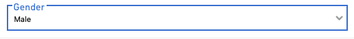
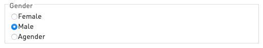
Control Type
For any input field which provides selection values (excluding Country / Nation selection) you can choose the input type in the form, three different types are available.
Dropdown
Radio
Tile
Input Fields - Special Functions

Input with Confirmation
It is possible to capture an input value and require a second input as confirmation, for example when recording e-mail addresses.
This is not achieved using a special function, but instead is achieved by creating a child element (indented) direct below with the same input field.

Upload File

A file can be uploaded and will be saved on a raceresult.com server. The URL of the file will be saved in the field.
Upload Picture
Same as Upload File, but only accepts pictures.
Signature

Creates a drawing pad which can be used to capture a signature.
Street + No. Separated

Creates 2 input fields to capture a Street and House Number separately, the 2 values will be automatically concatenated when saving the value.
Select Value
Creates a dropdown based on the values already saved for the field. An optional filter can be used to filter values for participants who should not be included.
Propose Value
When typing a value then a list of suggested values will be shown below, based on values already saved for the field. This option still allows entry of new values.
Select Wish Bib Number
Provides a dropdown for the user to select their desired Bib Number, this is based on the Bib Number Ranges, only values not already selected in this field will be displayed.
Only available for Single Registrations.
Enter Wish Bib Number
Similar to Select Wish Bib Number this will only accept values which have not already been entered to this field, but this allows the user to enter any number. If the possible number range is too large then the dropdown can create browser performance issues and so Enter Wish Bib Number would be recommended.
Only available for Single Registrations.
Time Entry (HH:MM) / (HH:MM:SS)
Creates a field with dropdowns to enter a time value with either hours and minutes or hours, minutes and seconds. This ensures only valid times can be entered.